When I first thought about my goal to “Make Ten Everyday Things” in 2016, I tried to think of a good way to document the process/plans/frustrations/etc. That lead me to Everyday Thing 1 of 10, a website. It fits within the rules and provides a platform for documentation. As for the documentation of how I built this website I am going to be relatively brief but provide lots of links to the resources that I used, they are written a thousand times better than anything I could write.
Step 1 – Why am I building a website?
Going into this project I knew that I wanted a platform to share projects that I am working on/completed. In addition, I would like a place where I could share some of my photos and how I created them. Then, there is question of “To Blog or Not To Blog?” Did I want to have a blog that I update, or just have static webpages like this one? In the end, I decided to have a blog on the site to see if I would use it and get rid of it later on if I didn’t. Thinking about all of this prior to actually building the site helped me make better decisions down the line.
Step 2 – Website builders
At this point you have to pick how you are going to build your website. I would take a hard look at what your skills are regarding website building, what previous experience you have and how much time you want to invest in it. For me, I know that html code exists and a very basic understanding of how it works, e.g. I have very little skills in this area. I have previously built a website using WordPress, so it made sense to use it again. And finally, I did not want to spend more than a weekend getting the site up and running. Considering these things I was pretty sure WordPress was the way to go, I definitely could of been wrong but it is the route that I when with. I will note that during the process for deciding what to do for my website, my mother decided to make a WordPress website for her artwork. As her Chief Technology Officer, I get to help figure things out so this really cemented in the fact I should use WordPress.
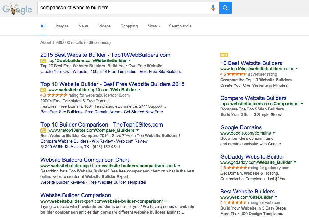
While I was trying to figure out which builder to go with I googled “Comparison of Website Builders”. It returns a bunch of links and ads that all seem a little questionable, e.g. they are all sponsored by one site builder or another. I read a bunch of them, but took everything with a grain of salt.

At this point, having decided on WordPress, I started to do a lot of reading about using WordPress. A particular website, WPBeginner, was a huge help. I would definitely recommend to anyone that is considering building there first WordPress site to take a look at their site, especially the “Beginner’s Guide to WordPress” Series.
Step 3 – Where to host the website
Once I knew I was going to use WordPress, I needed to decide between a WordPress.com site or a site hosted by a third party. I have always wanted my own domain name, i.e. “JLouisLabs.com” or something similar, which required me to use a third party web hosting service. Using WordPress.com gives you a website with an address like “WordPress.com/JLouisLabs”.
Googling “web hosting services” turns up tons of hits offering to host your website. They all are offering various features at various prices. After being a little overwhelmed with all of the offers, I started by filtering out any service that did not provide easy WordPress installs. This actually eliminates a bunch of options. I had read good things about Googles hosting service, Google Domains, but they didn’t support easy WordPress installs, so they were out. In the end, I went with bluehost because they were the only suggested hosting service listed on WordPress Suggested Hosts at the time and they were also suggested by WPBeginner.
So far (2 days) bluehost has worked just fine and the install of WordPress was literally one-click. They do have a very intuitive back panel that provide access to all of the features (and places to purchase more). My only gripes so far are:
- There pricing is very a la carte, each feature cost more money. I guess this is a way to provide the lowest cost hosting by only choosing the features that you want.
- The one-click install of WordPress has a couple of extra plugins that link to there on-line marketplace for themes and plugins.
Other than that I am very satisfied with there services so far… I guess ask me again in a year! In the end, 2 years of hosting plus domain privacy protection cost me ~$100.
Step 4 – Choosing a WordPress theme
There are a range of WordPress themes to choose from, some are free, some are inexpensive, and some are not very cheap at all! I will start with these two facts:
- I am not a graphic designer… nor do I want to be.
- I knew that could not learn to modify themes via CSS or other means in the amount of time that I wanted to spend getting this website up and running.
With these in mind I decided that I was willing to spend money on a theme. I started by looking a articles on picking WordPress themes to get an idea what websites were reputable places to get themes. A couple of the better articles:
- Selecting the Perfect Theme for WordPress – WPBeginner.com
- How to Choose a WordPress Theme (And What I Use) – Amylynnandrews.com
- Choosing A WordPress Theme: 12 Things To Look For – cmscritic.com
Based on these articles, especially Amy Lynn Andrews’ article, I decide to take a hard look at Studio Press and their Genesis Framework. As I was reading about the features and looking at demos both on my iPad and my computer of various child themes I was thinking this looks really awesome, but what is the price? Well, it depends on how you buy it, just the framework, the framework and a child theme, or the framework and all of the child themes. I ended up purchasing the framework and a child theme, specifically the “Workstation Pro Theme”, and it cost me $99.95. Which was about twice what I was planning on spending! The real kicker, which I think has made it worth the extra money, is their theme documentation and examples, which makes the next step pretty simple!
Once you purchase the theme, you have to install it. If you purchased the theme through your WordPress Dashboard it should automatically download to the site and then you can choose to activate the theme under Appearance>Themes. In my case, I purchase the theme from a third party so I downloaded the theme (actually two in my case, the Genesis Framework and the Workstation Pro child theme) to my computer and then uploaded using the “Add New” button under Appearance>>Themes.
Step 5 – Customizing your theme
I am not going to go into too much detail here, since the exact process is dependent on theme that was chosen. This process was very simple due to the theme that I chose from Studio Press. Once you purchase the Genesis Framework and a child theme you get access to great documentation on how to use the Genesis Framework, how to specifically modify the child theme that you chose, and all of the files to recreate the demo website for the child theme. I started by following the instructions that Studio Press provided to upload the demo website, this provided me with some basic content that I could use to play around with. I started by used the step-by-step instructions provided by them as well to set up the Front Page using the demo content. Then, I messed around with the various demo pages to get a feel for what I could and could not change.
One of the things that I had to thing about for a while was do I want to enable comments? For the initial launch of the website, I decided to leave comments disabled because I didn’t want to deal with figuring out how they worked or how to prevent large amounts of spam.
Step 6 – Setting up the various pages of the website
Once I got a feel for my options in terms of page layout, I started to mentally layout the website. Here is the page hierarchy that I came up with:
- Front Page – Contains Featured Projects, Recent Blog Posts, Menu at the top to navigate
- Projects Page – Contains a List of all of the active/completed/future projects, with links.
- Each project would have its own page(s) that was linked off of this page, with featured projects included in the menu bar at the top of each page.
- Photography – At this point all I knew is that I wanted a section to share some of the photography stuff I have worked on. I was not sure what this part would look like.
- Blog – A list of all of my blog posts.
- About Me – A page dedicated to your truly.
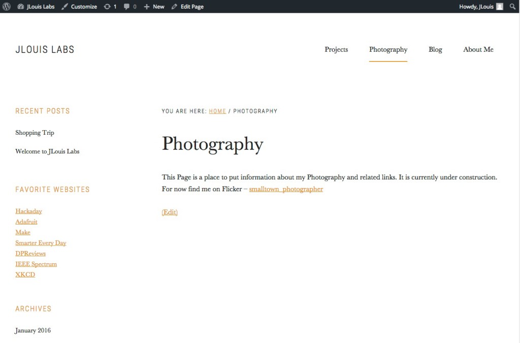
At this point I was really glad I had uploaded the demo website because it already had the Front Page, the Blog page(s), and the About Me pages set up. All I had to do for those pages was to ensure they looked the way I wanted and then start adding content. For the rest of the pages, I created relatively blank pages with just a line about what the page was for. For example, my page on photography said “This Page is a place to put information about my Photography and related links. It is currently under construction. For now find me on Flicker – smalltown_photographer“. I added the portion about Flicker since this page was going to launch with the website.

Step 7 – Adding content
This was the longest part of the entire process. After setting up the overall layout of the website, I came up with a list of things that I wanted to accomplish before the site “went live”. This provide we with a finite amount of tasks that I could accomplish in the time I had. Here is what I came up with:
- Write this log/description of the process of creating the website.
- Create at least 2 blog posts – One to explain why I created the website and one to announce the completion of this page (I ended up with 2 more)
- Fill in the Projects page with current projects and ideas for project related to my “Make Ten Everyday Things” project.
- I planned on leaving the photography section alone for the time being
- Writing the About Me page.
- Make sure the Front Page look half way decent.
Step 8 – Launch it
When I started building this website there was an “Under Construction” page if you visited the domain… Somewhere along the way it disappeared. Evidently, my website was out in the wild and I didn’t even know it! I guess that took away any nerves I had about launching the website.
